Expert class Type design
Online edition 2025–26
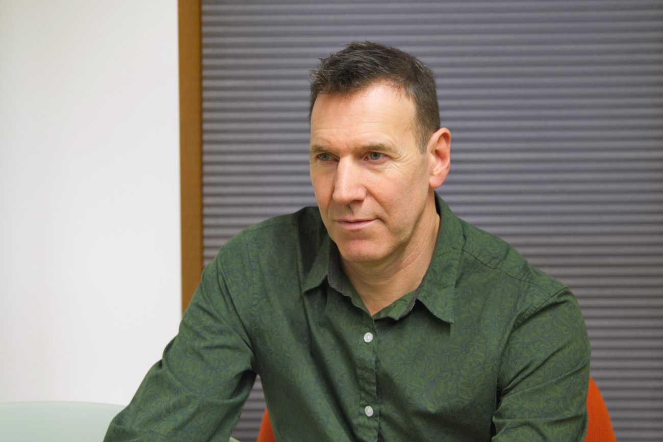
The Expert class Type design provides a comprehensive curriculum that combines lectures, discussions, and exercises guiding students through the design and production of digital typefaces. This course is taught by the British type designer Jeremy Tankard.
Principle tasks include:
- a set of four workshops, held in Antwerp, followed by nine online sessions,
- a group project and exploration,
- a personal typeface design,
- the graduation exhibition.
Four-day Kick Off event
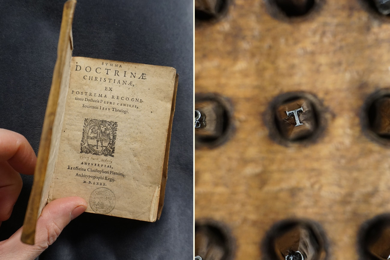
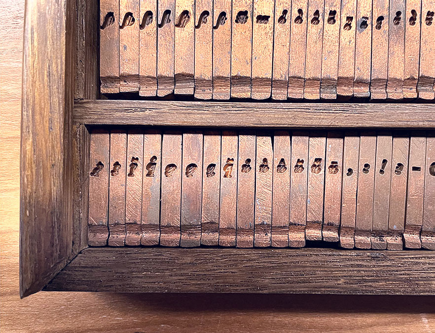
The workshops are held during the Kick Off event (20–23 October 2025), an intensive and immersive four-day program in Antwerp, packed with in-person lessons, exercises, guest lectures, study visits and social activities. Experience teaches us that these intense four days are an ideal opportunity for the students to get to know each other better, and to immerse the group in the invaluable collection of the Museum Plantin-Moretus, with punches, matrices, historical prints and type specimens.
The workshops are designed to deliver, and expand on, a base typographic knowledge; introducing core concepts that will be used throughout the course.
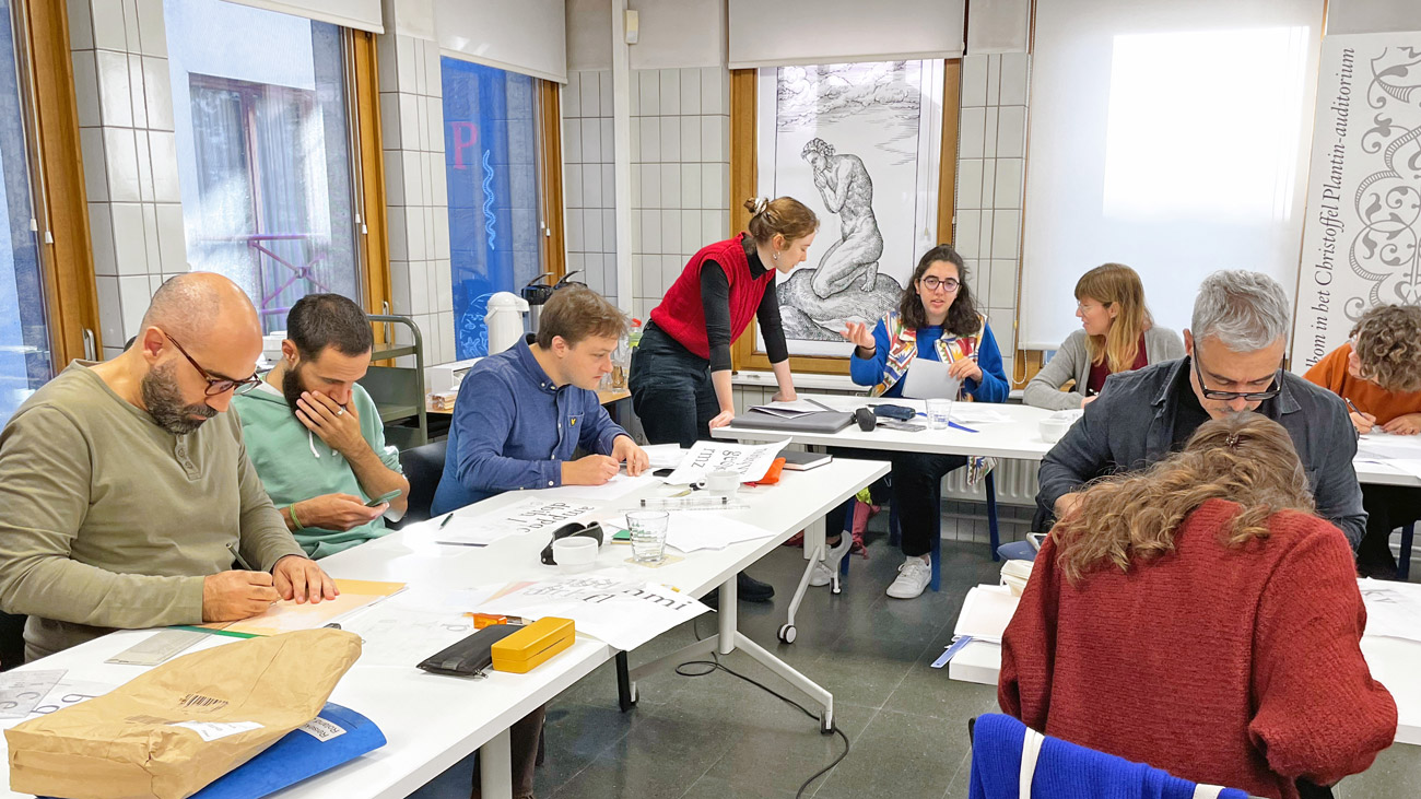
The class of 2024–25, during the Kick Off.
Subjects covered:
- Type history and development
- The purpose of type – past, present, future
- The shaping of letters and their optical effects
- The mechanics of type – texture and rhythm in text
- Expanding the family – such as bold and italic
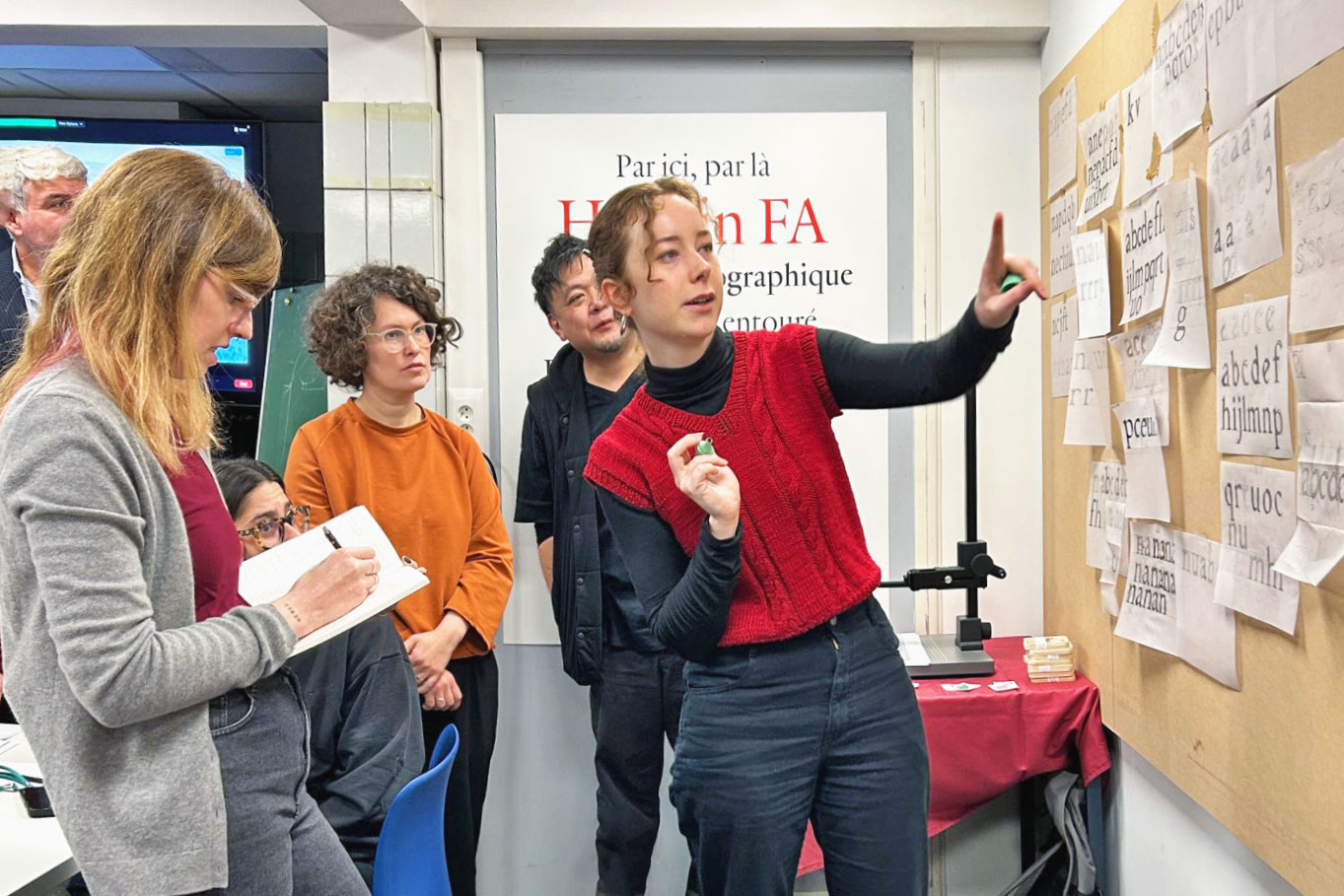
The group project, that will be introduced during the Kick Off event, will focus on title pages found in the precious books of the MPM collection. Working in small groups you will be asked to consider a range of criteria to complete, in order to evaluate, present and discuss these in detail.
During the Expert class we will be using the unique MPM collection to inspire the creation of fresh type designs. You will realise that type is part of a continuing history and that you have the opportunity to contribute to this. By experiencing and understanding key historical developments, technologies and typography, you will be better equipped to create fresh ideas. Our ambition is to foster in you a passion for advancing typographic design.
Nine online sessions
The subsequent online sessions, given between November and May, guide you through aspects of type design enabling you to complete the design of a typeface.
Subjects covered:
- The shapes of letters and their combining effects.
- What constitutes a letter? The importance of proportion, structure, harmony, shaping and detailing.
- What are the archetypes and what changes are acceptable or not? The needs of readability and legibility. Rhythm and patterning across the typographic image.
- The production process, from start to finish. Working methods incorporating research, sketching, drawing and digital development. Correcting and evaluating work as it progresses. Establishing core typographic features and elements that support the developing type.
- Expanding the core set with additional glyphs including small capitals, diacritics, number sets, punctuation, math and symbol sorts.
- Fitting, kerning, hinting, testing and final font production.
Taking the Expert class online implies that research in the reading room of Museum Plantin-Moretus is not possible. To get around this, students will be provided with high-quality photos and scans of title pages, type specimens, punches, smoke proofs and matrices from the museum’s large collection.
Lecturer
Jeremy Tankard is a graduate of Central Saint Martins and the Royal College of Art. Initially working at Addison Design Consultants and then Wolff Olins, he left corporate design in order to pursue his interests in type as an independent type designer in 1998. Jeremy has designed type since the early 90s. His first typeface, Disturbance, was released through FontShop International in 1993, followed by Bliss in 1996 as part of the Agfa Creative Alliance and later by typefaces for Adobe and Microsoft.
Eclectic in inspiration and reference, Jeremy continues to design a diverse range of typefaces that aim to provide new visual textures for creative expression. While some designs are bespoke commissions, many are available for licensing through typography.net.
The compliment website studiotype.com shows brief insights into the inspiration, research and process of both the bespoke and original designs.
Guest lectures during the Kick Off
Monday 20 October, afternoon:
- In the reading room we will look at a number of matrix sets and punches, selected by Joost Depuydt, curator of typographical and technical collections.
- Type specimens from the collection of the Museum Plantin-Moretus and the Plantin Institute of Typography
Tuesday 21 October, afternoon:
- Guided visit to the Museum Plantin-Moretus
- Demo: printing on the wooden press
Wednesday 22 October:
- Afternoon: Joran Proot, museum classroom
- a show-and-tell with books from the Museum
- Exercise: the typographical evolution of books between 1500 and 1650
Thursday 23 October:
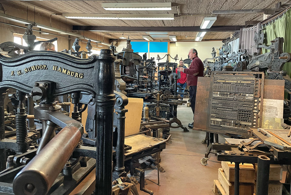
- Afternoon: visit to the workshop of Patrick Goossens in Wilrijk
- Tour of the collection of iron hand presses from the 19th century
- Explanation about the Benton engraver
- Printing demos: demos of the Linotype, Monotype and type casting
- Farewell diner
Requirements and admission
The Expert class is designed for graphic designers with a keen interest in typography. It will be intensive, hence ‘Expert’ in the title; but perfectly achievable and very rewarding. Students who positively complete the course obtain an officially recognized post-college certificate.
The course is highly international, attracting students from various countries. Consequently, lessons are conducted in English.
Requirements:
- Graphic/typographic design understanding
- Manual drawing skills
- Computer literacy
The software used will be Glyphs 3 (Mac), but you can also use FontLab 8 (Mac/Windows), RoboFont etc. Basic understanding is all that is needed, the course is staged to walk you through a process easily and logically so not to overwhelm with technology and stress. - Commitment of personal time
The course is spread over an academic year and it is expected that you are actively working between lessons, developing your work ready for the next lesson’s focus. - Close collaboration
The intention is that as a group you freely communicate between yourselves over a shared platform such as Slack, or Miro. By sharing thoughts, work and asking questions, you will progress quicker and further between each lesson stage.
Practical information
Calendar: A four-day Kick Off on-site in Antwerp, followed by nine online sessions.
Kick Off: Monday 20 October till Thursday 23 October 2025.
From 9.30 a.m. till 4.40 p.m.
Online lessons: Friday 14 November, 5 December and 19 December 2025.
Friday 16 January, 6 February, 27 February, 13 March, 3 April and 24 April 2026.
From 11 a.m. till 4.40 p.m.
Location: Museum Plantin-Moretus, Vrijdagmarkt 22, 2000 Antwerp, Belgium, and online via Zoom.
The reading room of the museum is open on week days from 9.30 a.m. till 4.30 p.m.
Enrolment fee: € 2100
Enrol by filling in this form or by sending an email to plantin.instituut@antwerpen.be
We will be organizing info sessions on 15 March, 17 May and 21 June. More info on our Open Day page.