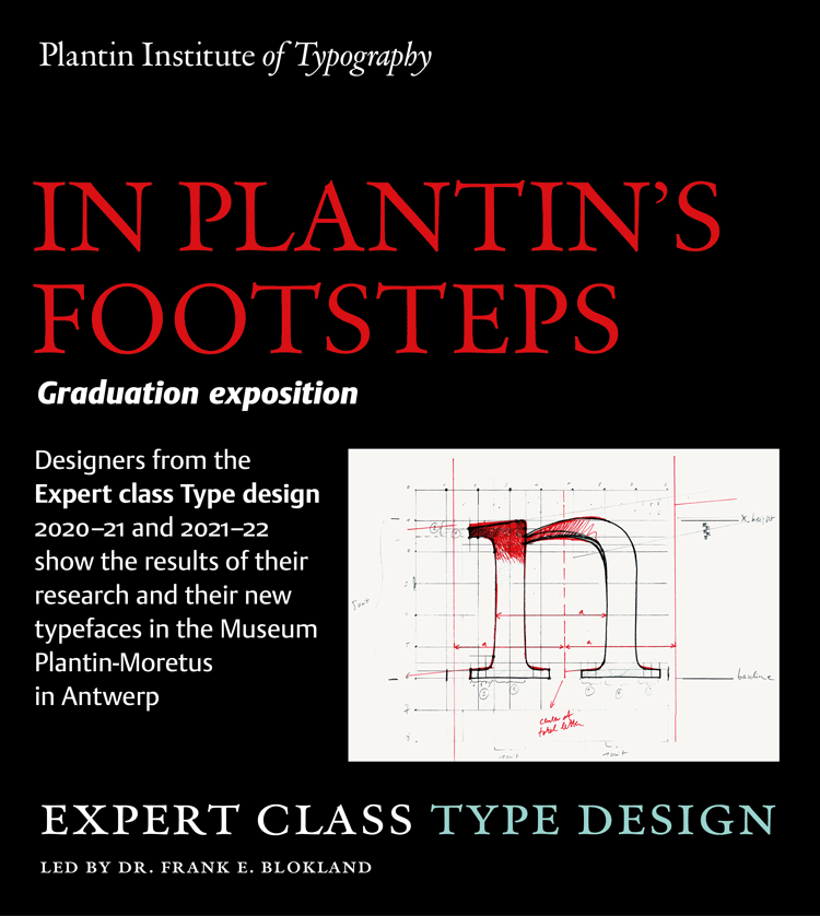
Type designers from all over the world got inspired by the typographic heritage from Antwerp
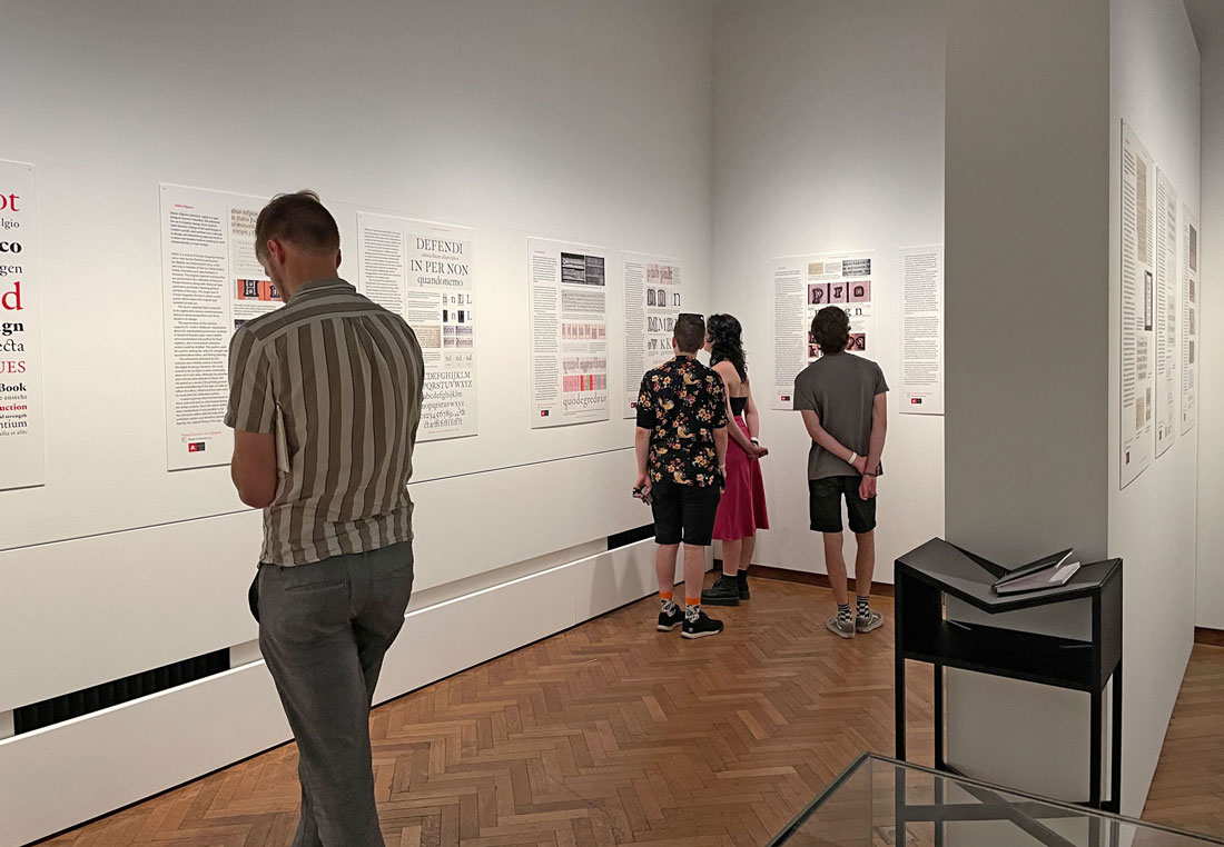
Until Sunday 25 September the graduation works of the Type design students are on display in the exhibition hall of the Museum Plantin-Moretus (MPM). The students did intensive research and created 19 new typefaces based on type-foundry artifacts and old prints from the museum collections. You will be surprised how broad the research was. Punchcutters from the Renaissance, Baroque and modern times were examined.
 Type design
Since 2010 the Expert class Type design has been taught by Dr. Frank Blokland, the well-known Dutch type designer, software developer and academic. All classes were conducted online, so that overseas students could also attend our unique curriculum. Students came from all over Europe, North and South America and Australia. Last year there was no exhibition of graduation works due to covid-19, which is why the work spanning two academic years is now on display.
The students answered two research questions. One group examined to what extent Baroque punchcutters followed the models of the Renaissance. More specific, the work of Christoffel van Dijck and Nicolas Kis was compared to that of Hendrik van den Keere, who still worked for Plantin.
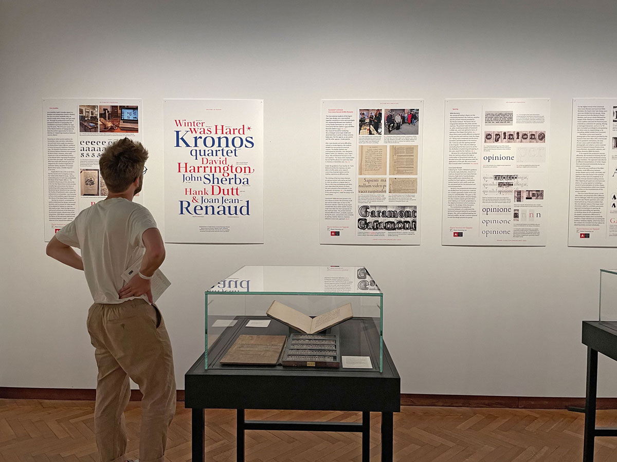
The other part of the student body explored two extremes in Claude Garamont’s work. The Museum Plantin-Moretus keeps the punches, matrices and prints of one of his large display types, called Gros Canon Romain. These have been carefully compared with the artifacts preserved from a letter for minuscule text (Bible). These comparisons are illustrated with photos in the exhibition and the original source materials are also on display.
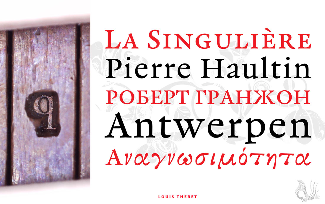
This article cannot cover in detail all the new fonts that the students individually created for their second assignment. Four amongst them worked with the Pierre Haultin punches and matrices. Haultin is known as the punchcutter of the smallest letters in existence in the 16th century, referred to as 'nonpareille'. It is astonishing that someone at that time was able to cut such small letters from a steel punch with a burin and file. During the tumultuous Reformation period, very small editions of the Bible were in great demand because when necessary they could be quickly concealed. The small types for these Bibles remained in demand among printers for more than 200 years. Today, the relevant revivals the students made are really suitable for e-books. Even in a small type sizes they remain sturdy and pleasant to read.
Other students ventured into script fonts. You can see a revival of the Charactère de Finance that was cut by both Rosart and Fleischmann. The student in question did a thorough examination of the historical examples, and the revival shows great talent. Gerard Mercator and Susanne Heynemann's calligraphy were examined using microscopes and special font software (GlyphCollector).
In the Renaissance or Baroque periods women had no access to the craft of punchcutting, so all the illustrious examples are men-made. One student sought and found stunningly beautiful work from the 18th century by Angela Baroni from Milan. She came from a family of copper engravers. The book she made in 1740 has no fewer than 427 pages, all of which were engraved on copper plates. This revival based on her work stands out, because of its angularity and this new typeface will certainly find great success in contemporary (book) design.
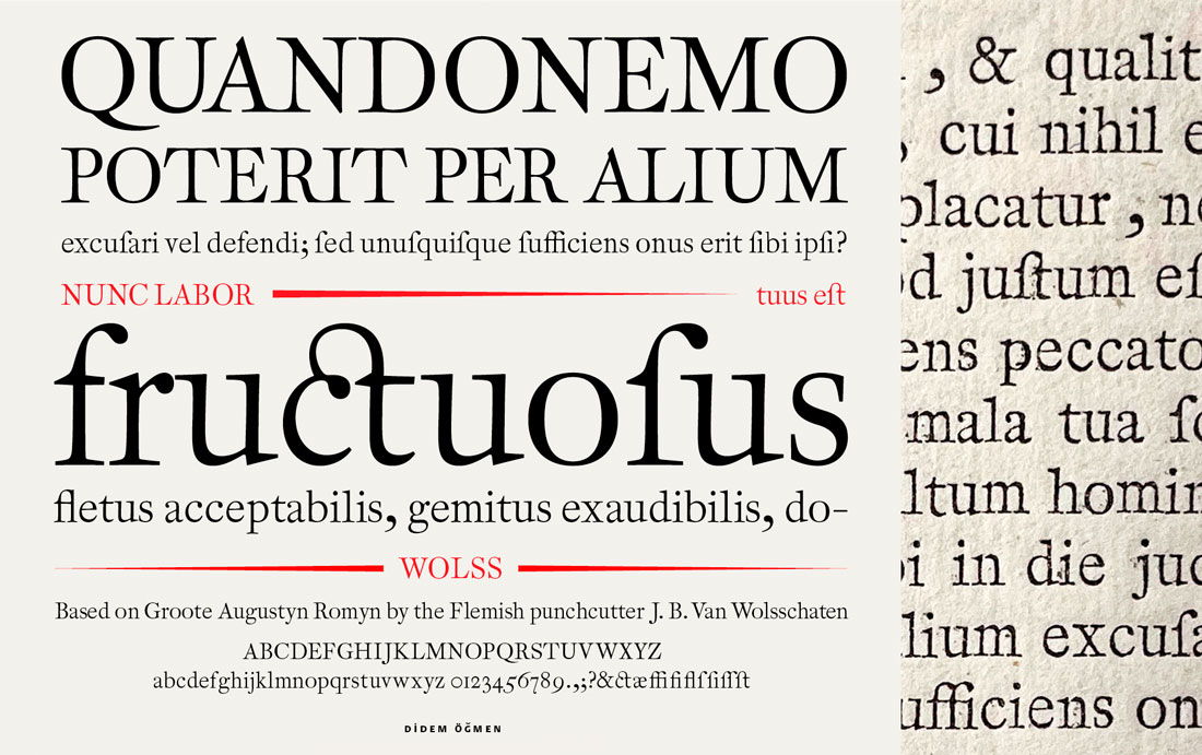
The pointed, light and narrow letters of Jan Baptist van Wolsschaten (1714–1776) inspired two students. Their thorough preparatory investigation of the systemization and the patterning in the historical examples resulted in a harmonious revival, very suitable for running text.
Further revivals on display are based on (work of):
- Hendrik van den Keere
- Granjon, in a search for harmony between Latin and Greek characters
- Renaissance letters of Guyot combined with wider capitals by another punchcutter
- Baroque letters by Briot, who influenced many punchcutters in his time
- Nicolas Kis and revivals thereof made before WWII by Schriftgießerei D. Stempel
- A 19th-century Scotch that will be turned into a sans serif
Book design
Also on display is the graduation work of the students in the Expert class Book Design. Every student made a new design for a non-fiction book, Patterns in Nature. Step-by-step they went through the entire design and production cycle of their rendition of the book. The differences in their designs, material choices and production methods are really surprising.
These designs were previously on display at the Antwerp University library. This time the books can be browsed, which was previously not possible due to covid-19.
Practical information:
- In the four rooms of the MPM exhibition space, Vrijdagmarkt 22, Antwerp.
- Until September 25.
- Daily from 10 a.m. to 5 p.m. Closed on Mondays.
- Included in the ticket price of the MPM
Students Type design 2020–21 and 2021–22:
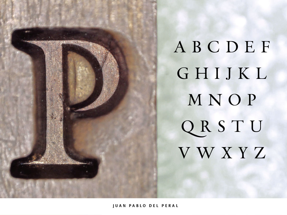
Valentina Casali, Luis Castellon, Paulo Chagas, Joaquín Pedro Contreras Soto, Juan Pablo del Peral, Michelle Devlin, Joe Elwell, Benjamin Fallon, Pedro Furtado de Albergaria, Nikita Iziev, Ben Kirk, Johannes López Ayala, Didem Ögmen, Lena Oster-Daum, Deiverson Ribeiro, Walter Oscar Rothe, Rafael Saraiva Soares, Andrea Tartarelli, Louis Theret.
Students Book design 2021:
Nanda Coppens, Yiannis Papadopoulos, Laurien Van Hoey, Geert Verbist.
Not with their book in the expo: Trudy Bruil, Kevin Reynaert, Marieke Van der Perk.
New classes – The Expert class Type design will start on October 17, 2022.
The Expert class Book Design will start again on January 14, 2023.
It is still possible to register for these two courses.